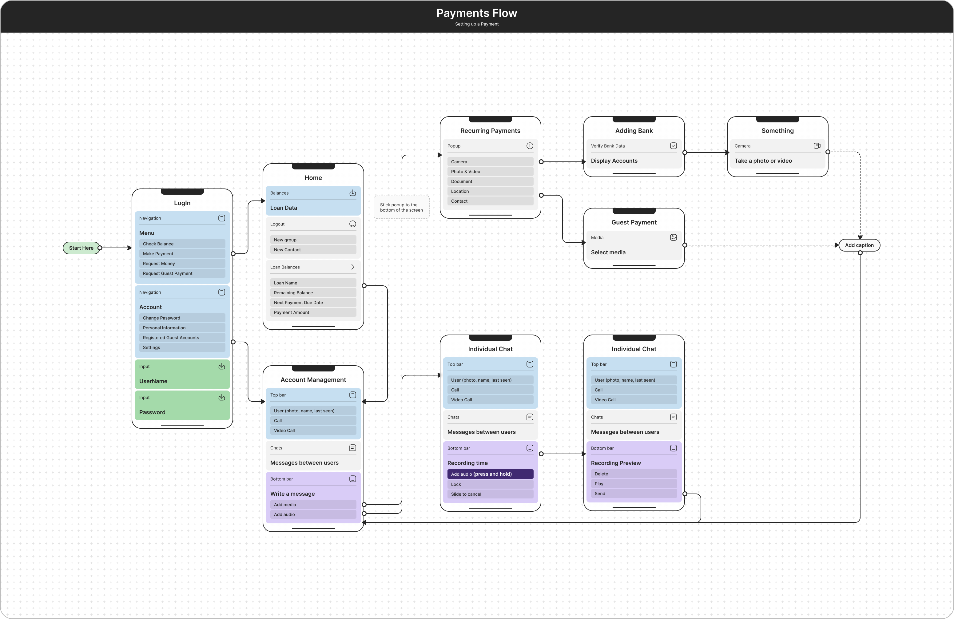
Making Payments Easy for Smartphone Users
A redesigned taxonomy and Information Architecture, along with interaction design changes, reduced call center volume by 82% within two weeks after the launch of our redesigned app.
The company's target customers for the mobile app were busy students, folks for whom the smartphone is a permanent fixture of nearly every activity they undertake.
They consider traditional websites to be complicated and tedious, and our research showed that they would abandon making payments solely based on the ease of using its mobile app.
We also learned that a significant number of the traditional terms, labels, and language banks use everywhere in their digital products were almost completely foreign to these users.
The company was getting many complaints about its website payment system. Their data showed an increasing number of users abandoning the payments they’d started.
The company believed their users didn’t notice that a payment was due, so they began flooding users with reminders by mail, text, email, and automated voicemail. This strategy only made things worse. What the users needed was an easier way to make a payment on their smartphones.
My solution was to modify the responsive website that was already in place and use a mobile-first design. The solution took into account how distracted people are when using their phones.
My role in the project
As the Senior UX Designer, I collaborated with the Lead Software Engineer, Front-End Developer and Call Center and Accounts Manager to iterate on and test possible improvements to reduce call center volume.
We each had specific responsibilities; my job upfront was to organize and design usability testing sessions with users to figure out why they were abandoning the app and calling for help.
Key learnings from this project:
Follow Best Practices for Mobile UX
When users are familiar with the interaction it feels natural.
Design for the Most Challenging Environment
Noisy and distracting environments reduce mental bandwidth. Make it as easy as possible to return to a task.

