Week 1
Simplifying the Survey Questions for Readability
The original survey questions written by research psychologists were confusing. Every question was analyzed and edited into an elementary grammar level, conversational "sound bite" that was easy to comprehend.
Following the mantra of "don't make me think," we recorded and user tested them in batches until we we hit a benchmark of <3 second response time.
Week 2
Simplifying the Survey Questions for Readability
The original survey questions written by research psychologists were confusing. Every question was analyzed and edited into an elementary grammar level, conversational "sound bite" that was easy to comprehend.
Following the mantra of "don't make me think," we recorded and user tested them in batches until we we hit a benchmark of <3 second response time.
Week 3-4
Simplifying the Survey Questions for Readability
The original survey questions written by research psychologists were confusing. Every question was analyzed and edited into an elementary grammar level, conversational "sound bite" that was easy to comprehend.
Following the mantra of "don't make me think," we recorded and user tested them in batches until we we hit a benchmark of <3 second response time.
Mobile tablets and headphones allowed 60% of health survey participants to complete their task.
A mobile survey app with voice support for participants with reading challenges, along with interaction design changes, allowed survey participants to complete the task 60% faster and with more accuracy.

My role in this project
I collaborated with a team of two freelance designers and two clinical staff members. Our primary objective was to improve the accuracy and speed of the data collection.
We wanted to ensure that the data we gathered was reliable and could be analyzed to draw meaningful conclusions.
This was all completed in five weeks, with an onboarding section added after working on the service design. (This project was done first - the service should have been designed first. Lesson #2.)
Week 2
Simplify the Survey Questions for Readability
The original survey questions written by research psychologists were confusing. Every question was analyzed and edited into an elementary grammar level, conversational "sound bite" that was easy to comprehend.
Following the mantra of "don't make me think," we recorded and user tested them in batches until we we hit a benchmark of <3 second response time.
Week 3

We spent the last week improving interaction flow and UI design. We removed several chunks of marketing content from the report request screen, along with a great deal of unnecessary instructional text. We also reorganized the sequence of finding a report, necessitating some small changes to Information Architecture and
app structure.
Finally, we increased contrast and visual dominance of call-to-action buttons and
simplified their labeling. We committed and launched all changes that Friday.
By the following Thursday, only six days after the end of our second sprint, calls
had dropped by 74%.
Lessons learned from this project:
Study the context as well as the users.
Lorem ipsum dolor sit amet, consectetur adipiscing elit, sed do eiusmod tempor incididunt ut labore et dolore magna aliqua. Quis ipsum suspendisse ultrices gravida. Risus commodo viverra maecenas accumsan lacus vel facilisis.
Design the experience first, then add products to the service.
Lorem ipsum dolor sit amet, consectetur adipiscing elit, sed do eiusmod tempor incididunt ut labore et dolore magna aliqua. Quis ipsum suspendisse ultrices gravida. Risus commodo viverra maecenas accumsan lacus vel facilisis.
Week 3-4

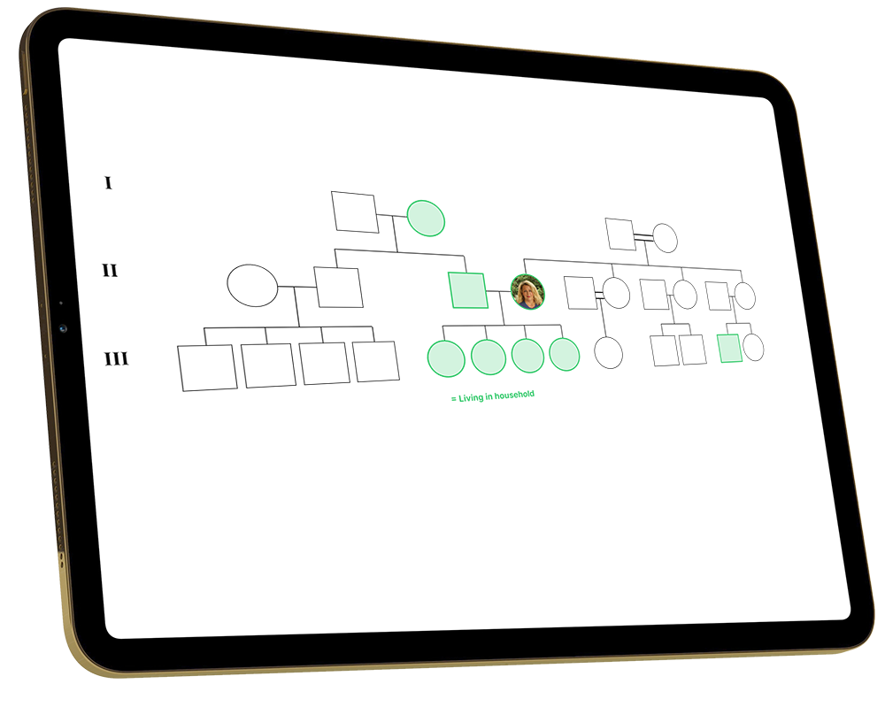
The morning check in was a bottleneck. Each family had to report all the members of their family and the registrar would have to assign ID#s, ask detailed questions about each person, and draw a three-generation pedigree.
We boiled down the process to five questions for each family member, and auto-assigned unique ID#s. The computer would then link the family and generate the pedigree diagram.
