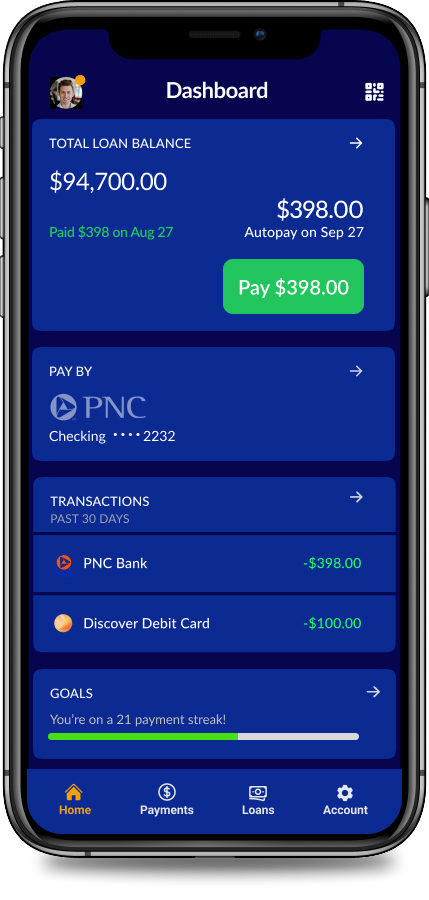
Secure Smart payments
How a mobile redesign saved $200K
by reducing calls to the help center.
The project's primary challenge was addressing the needs of busy students who found the loan company's mobile site cumbersome and confusing. The complex forms and unfamiliar financial jargon led to frequent abandonment and subsequent late fees, causing users to post negative reviews of the company online.
Lessons learned from this project.
Design for and test in the most challenging environments.
Our users were often in noisy or crowded environments that make it hard to concentrate. We hadn't tested in all the locations early on and had to make adjustments to contrast and text size because they failed in the low light of the real world.
Make error recovery easy and obvious.
We didn't find this until late in testing because most people would key in the information at a point of error. Auto scrolling to the point of error and highlighting the input without clearing the field helped users correct the error and move forward.
research & Initial testing
From Insight to Impact: Streamlining the User Experience
We *** Replace text here****
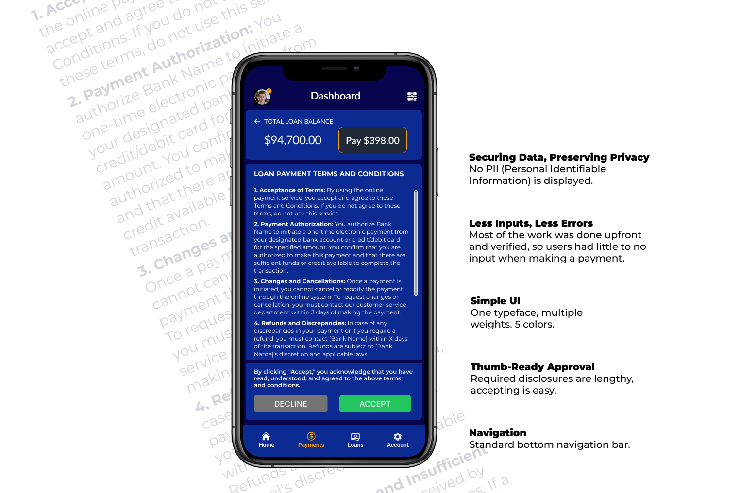
“Don’t Make me Think”
Preloading Data Reduced Cognitive Load
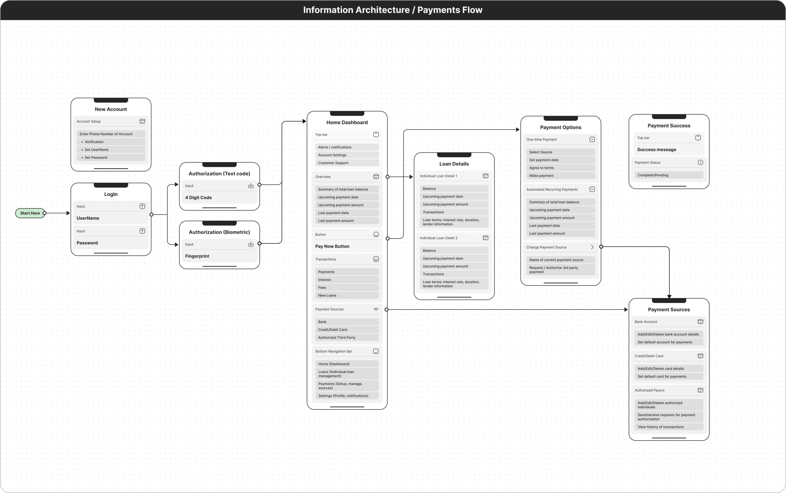
Originally, users had to enter a unique ID that had no meaning and was hard to remember.
This led to customer service calls and abandoned payment attempts. We added two factor authentication and had users load payment methods and complete their profiles during onboarding, making the process infinitely easier.
Task Flow
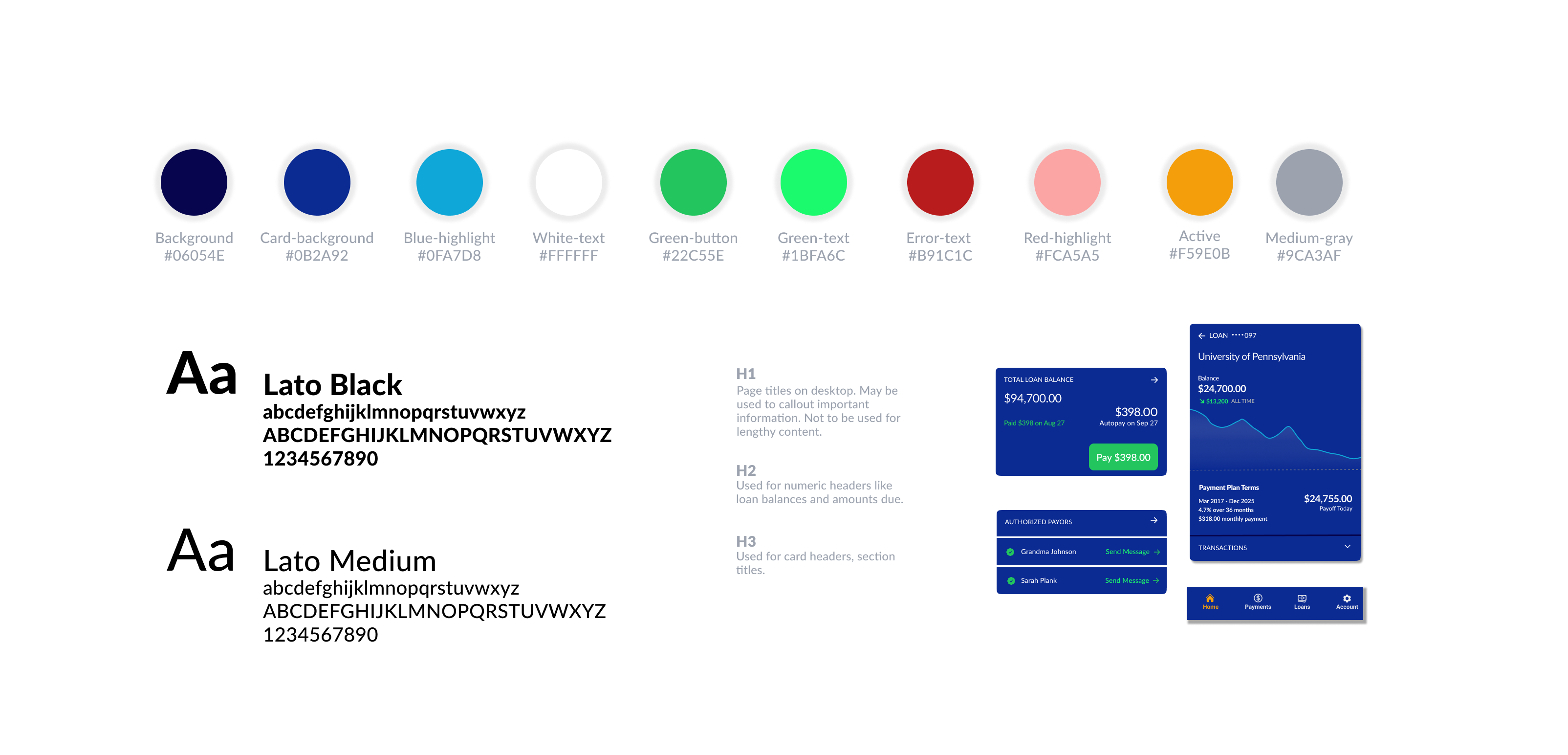
design system
Simple designs and standard mobile UI elements
Ensures Accessibility
